The version 3.0 release of the remoteit Desktop introduced the "Responsive UI" which changes the screen layout depending on how much horizontal screen space it occupies.
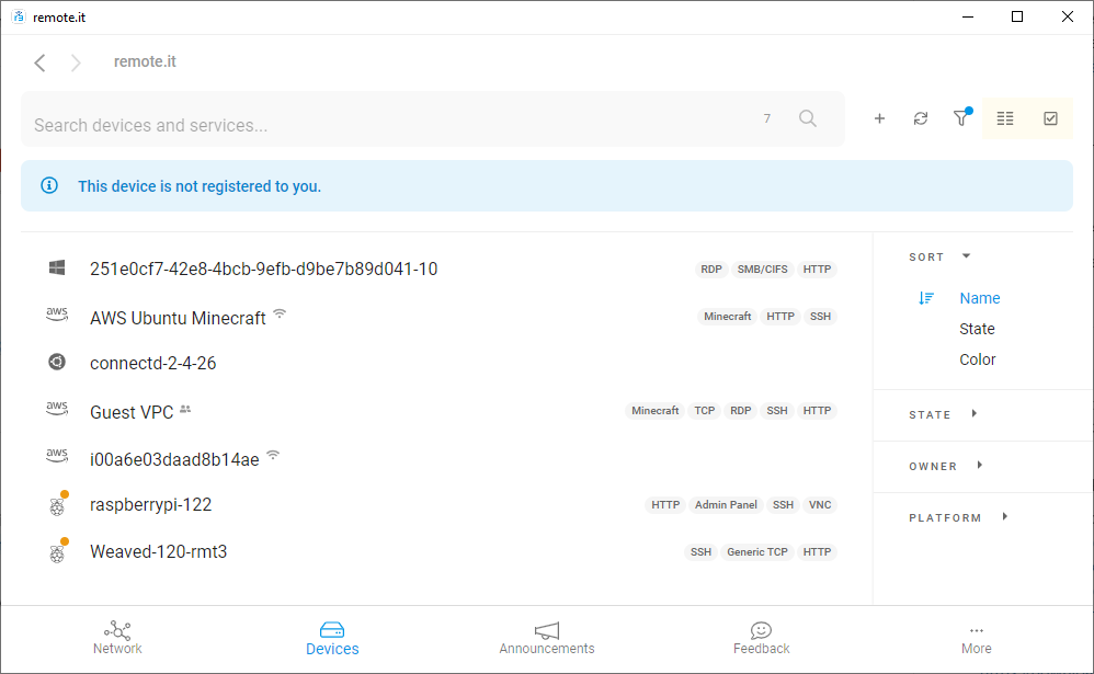
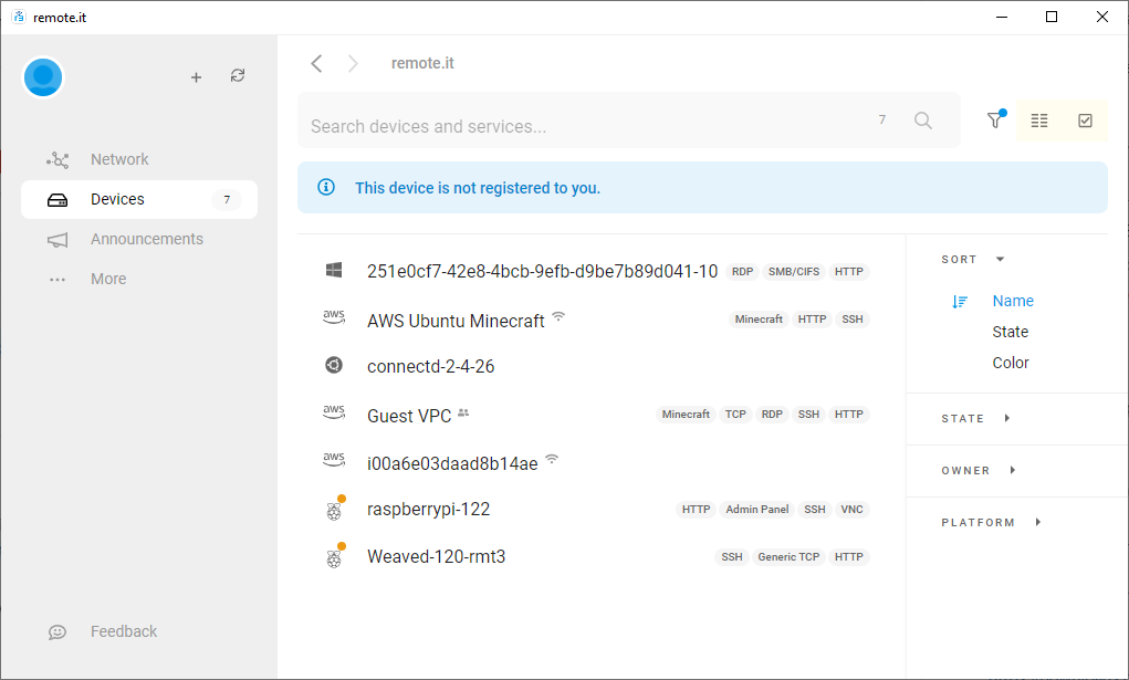
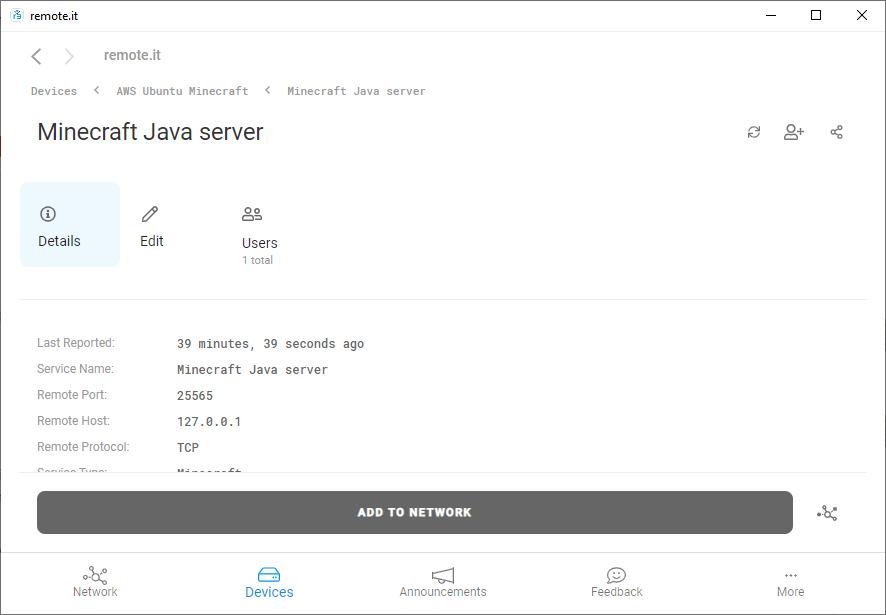
Narrow Layout
If the width of the remoteit Desktop is 1000 pixels or below, it will display as shown below.
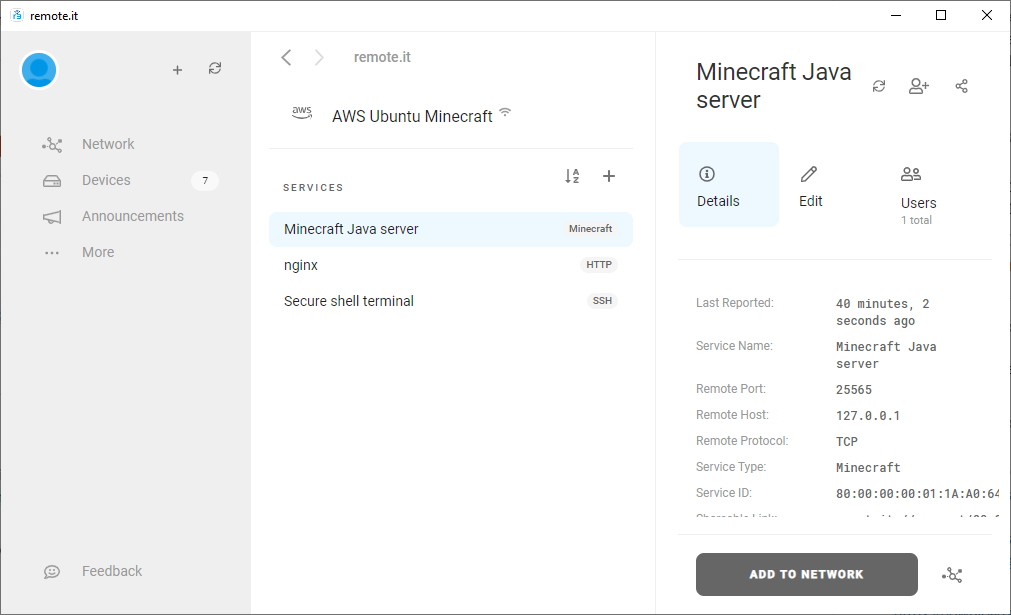
Wide Layout
If the width of the remoteit Desktop is above 1000 pixels, it will display as shown below.
Main differences between Narrow and Wide Layout
In Narrow Layout:
- The main features "Network", "Devices", "Announcements", "Feedback" and "More" are on the bottom edge of the application.
- Account settings are accessed through the Blue icon
 at the upper right of the "More... Settings" view.
 - The "refresh" icon
 is at the upper right.
 - When you click on an item to edit it, the details will open up in the bottom section of the screen.
In Wide Layout:
- The main features "Network", "Devices", "Announcements", "Feedback" and "More" are in the panel on the left edge of the application.
- Account settings are accessed through the Blue icon at the upper left in all views.
- The "refresh" icon is at the upper right of the left panel.
- When you click on an item to edit it, the details will open up in the right panel of the screen. Additional details will be displayed in the center panel.